 Colin Angus recently demonstrated various visualisations that he had created for Covid-19 mortality on Twitter. Here he elaborates on his approach to this work.
Sometimes the best and most interesting ideas come from seeing a new application of other people’s work.
By mid-March, emerging data from Northern Italy clearly showed that COVID-19 fatality rates were substantially higher in older age groups, particularly for men. Demographers Ilya Kashnitsky and José Aburto combined this data with data from EUROSTAT on the age-sex distribution of the population across European regions and published a fascinating pre-print.
This displayed the potential risk that each area faced from a large-scale COVID-19 outbreak. Areas with large populations of older men, such as parts of former East Germany, faced an expected mortality rate more than four times greater than areas with younger, more female populations, such as south-eastern Turkey.
We are blessed in the UK with some wonderfully rich data, including estimates of the population structure at very low levels of geography, right down to Lower Super Output Area (LSOA) level. I thought it would be interesting to replicate this approach to calculate potential COVID-19 exposure for LSOAs in England.
This was relatively straightforward using ONS population data, data from the Imperial College modelling study that estimated age-specific Infection Fatality Rates (IFRs) from COVID-19 and sex-specific Case Fatality Rates from Northern Italy, published by the Italian Statistical Institute ISS. There are a lot of LSOAs in the country (almost 35,000), so I decided to visualise my results for Sheffield, using an LSOA shapefile from the ONS Open Geography portal.
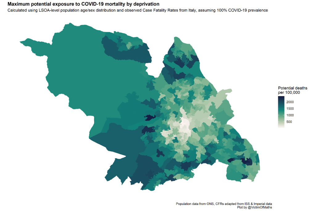
This immediately shows some huge variations in potential exposure between the central parts of the city in the middle of the map, with expected mortality rates of less than 100/100,000 even if everyone was infected, and the leafy suburbs in the south-west with rates of 2,400/100,000.
These results seemed potentially useful to help plan local Public Health responses to the pandemic, but something jarred with me about the fact that many of the LSOAs showing high mortality risk are among the most affluent in the entire country, while many of the most deprived LSOAs were identified as low-risk.
In addition to the evidence on age-sex risks of COVID-19, it was becoming very clear that people with pre-existing health conditions were at considerably greater risk of death.
As part of the calculation of the Index of Multiple Deprivation, the Ministry of Housing, Communities & Local Government (MHCLG) calculate a ‘health and disability deprivation’ score which reflects the levels of ill health and rates of hospital admissions within each LSOA. I wondered how the COVID-19 mortality exposure measure might be related to this measure of health, and so I brought in IMD data from the MHCLG Open Data portal.
I expected the relationship between health deprivation and the exposure measure to be complex, since greater deprivation is associated with poorer health, but lower deprivation is associated with older age, which is also associated with poorer health. This complexity was borne out when I plotted the relationship between the two for every LSOA – with a clear correlation between lower health deprivation and higher age-sex risk, but enormous heterogeneity between LSOAs within each deprivation decile.
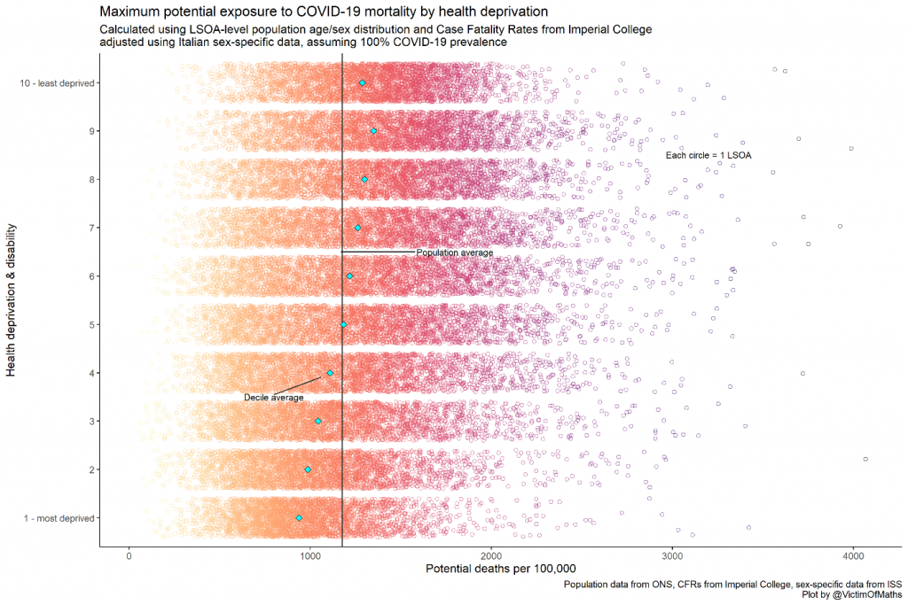
This plot suggested that Public Health activities might be best concentrated in areas in the bottom right, where health is poorest (on average) and there are more older people, particularly men. But how could I best visualise these areas?
In the end, I decided this was a perfect candidate for a bivariate map. These are a great way of visualising the joint spatial distribution of two variables, which work best when you are particularly interested in picking out the outliers in your data – either areas with high levels of both variables, or high levels of one and low levels of the other.
In this case I wanted to pick out areas with high levels of health deprivation and age-sex-specific risk. For more background on this sort of map, there’s a nice overview here. Here’s what the bivariate map for Sheffield looks like:
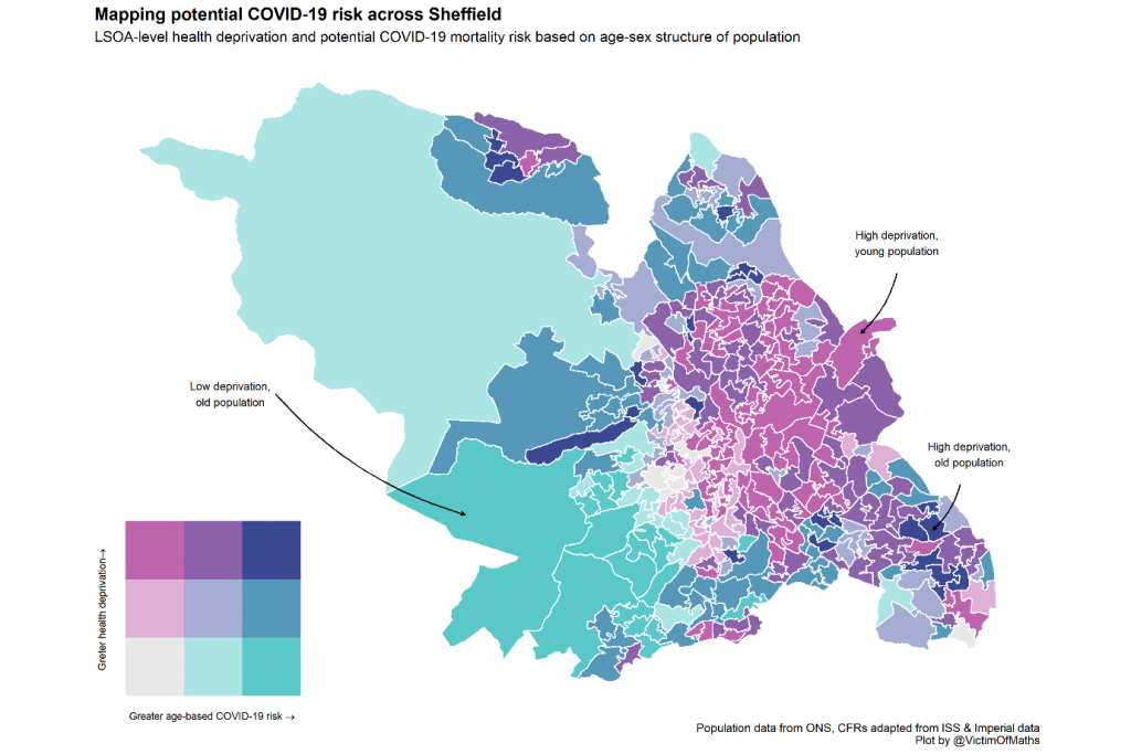
This map matched my intuition much better – young areas with poor health in the north west are clearly picked out, as are older areas with good health in the south west.
At the same time we can identify a relatively small number of areas for specific concern where the mortality risks from a large-scale COVID-19 outbreak are particularly high. Because many people won’t be familiar with this kind of two-dimensional colour scale, I generally try and add a few annotations to bivariate maps to help guide people’s interpretations.
The final step was to work out how to make these maps accessible to people working in Local Authorities around the country.
I posted the R code that I had used to make the map, in as user-friendly a form as possible, on GitHub so that people could easily create their own maps, but that still felt quite limiting. So I built a Shiny app. This was quite an adventure, because I’ve not used Shiny before, but it ended up being a lot easier than I initially feared.
The trickiest thing was working out how to get the huge LSOA-level shapefile onto Shiny’s hosting platform. In the end I used the excellent mapshaper tool to simplify the polygons in the shapefile until the whole thing was small enough. That’s why the maps in the app look much ‘blockier’ than the ones from the original R script.

In order to satisfy my aesthetic sense, I also made some large composite maps for a few major cities which are spread across multiple Local Authorities, such as Greater Manchester.
At the suggestion of Ilya Kashnitsky I made these maps slightly transparent and added some background road features using stamen maps to help place the various areas on the map in context. I’ve shared these maps with Public Health colleagues in various parts of the country and hopefully they were useful in helping to plan the early phases of the pandemic response.
You can find the R code used to generate these maps and the other plots in this blog here.
About the author
Colin Angus (@VictimOfMaths) is a Senior Research Fellow in the Sheffield Alcohol Research Group within ScHARR.
His work focuses on the design, development and adaptation of complex health economic models and their use to appraise key policy questions in the field of alcohol research. The majority of his research is based on the development of the Sheffield Alcohol Policy Model to incorporate new methodological developments, new data and to answer new policy questions, both in the UK and internationally.