
Rob Dymond-Green (Technical Co-ordinator for the Census Support Service) at the UK Data Service, continues his discussion of new ways of presenting the Service’s data collections. In part one of this series of posts Rob explored possible ways to highlight the spatial coverage of the studies held in our catalogue. In this post Rob continues this theme, moving onto exploring the temporal nature of the studies.

In the map above I wanted to produce a way to display the temporal coverage of the studies. I quite like this visualisation as it has a play/pause button which allowed me to first watch the chronological story of our data collection, then pause it and use the slider to see what was happening at different points in time.
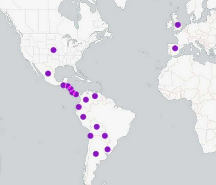
When the map first loads the first point to appear is in Italy, it occurs at year 440 and it represents our earliest study which is about the Christianisation of Rome, then there is a bit of gap to our next study at 700 (spread of religious devotion across Europe) the number of studies begins to increase after 1064 (English Episcopal Acta, 1064-1305), following this time the collection tends to be about finance, religion or status in Europe in the late middle ages, the collection begins to show the spread of Europe into the new world at 1550 (Wealth, Household Expenditure, and Consumer Goods in Preindustrial England and America, 1550-1800) with Spanish revenues and expenditures from 1570 (European State Finance Database) showing that you couldn’t avoid paying tax even in those days. After this the number of collections and geographic coverage increases until a crescendo in the early 21st century.
Through investigating ways to highlight the content of our collection, I’ve gained a better understanding of what riches there are in the collection, I know I’ve ended up having lots of conversations with my colleagues about the various studies that have caught my eye in doing this work, such as the Italian Charlatans Database, 1550-1800.
