 Louise Corti shares the challenges and opportunities from this year’s successful virtual Big Data Summer School at the University of Essex.
Introduction
Since 2016, the UK Data Service has run its annual ‘Encounters with big data: introduction for social scientists’ week-long summer school, co-ordinated by Louise Corti of the UK Data Service.
The aim of the course is to introduce some of the critical issues around the use of new and emerging forms of data for social research, and to establish both confidence and a firm grounding in the art of approaching and exploiting data of this nature.
The course complements the ever-expanding amount of training provision available on coding and data analytics with some of the more fundamental aspects; engendering awareness of potential challenges, from ethical and legal to methodological and practical, and an appreciation of undertaking reproducible research,
Up to now, these have been run in person, with no more than 20 people. The small group element provides a comfortable and supportive learning environment, and lends itself to group work and mutual support between students.
With the COVID-19 pandemic preventing usual face-to-face residential courses, Louise and the tutors agreed to run the course online in the summer of July 2020.
Background to the course
The week-long course run by the UK Data Service has been run five times in total, each time receiving praise from participants for the originality and practicality of its core learning objectives.
This year the course, Introduction to Big Data for the Social Sciences introduced key concepts and discussions around using big data in the social sciences. It also introduced approaches to and open source tools for exploring and analysing new and novel forms of data. Additionally, it looked at the challenges of reproducibility in social science and covers best practices in transparency for data creation, manipulation and analysis.
The course, aimed at researchers, statisticians, or data analysts, covered a range of critical aspects of data evaluation such as:
- ethical and legal issue
- data extraction and exploration
- basic analysis
- visualisation of data sourced from the web, using Spark R and various R Packages.
In addition to the hands-on lab sessions, participants spent a day and a half on group projects applying what they had learned on real data challenges. This course predominantly focused on numeric data, and didn’t cover in any detail text, social media or audio sources.
A reasonably high bar was set for registering onto the course; some screening questions were asked, ensuring that those wishing to join had familiarity with statistical analysis and software, be it Stata, SPSS or R.
A key component of the course is group work, with teams coming together over the week to brainstorm ideas and undertake a 2 day final project. The course typically attracts a range of data and software skills, from newcomer to the experienced R user, and students often collect themselves into groups where more experienced researchers can lead on some of the more technical tasks.
Past courses have seen some groups creative some inventive mini projects, sourcing new online data from APIs and creating some interesting visualisations to help answer a social science research problem.
Designing the 2020 course for a virtual environment
This year, as course organiser, Louise decided to increase the number of tutors on the course and decrease the maximum number of possible participants, anticipating factors such as the intensity of teaching complex materials on Zoom, and individuals and groups possible needing more one-to-one online support from skilled tutors.
A fantastic group of tutors were assembled:
- Louise, Cristina Magder, Myles Offord, Julia Kasmire and Diarmuid McDonnell from the UK Data Service
- Simon Parker from Cancer Research UK and ex-UK UK Data Service
The tutors met monthly to create the syllabus. Zoom was used for video conferencing and Slack was chosen to support flexible communication channels. Amazon Work Spaces was chosen for the data environment, due to the size of the data, and Essex Box was used to host course materials.
Multiple Slack channels were created to support communication:
- homework
- a line to individual tutors
- social
Participants were provided with clear instructions on how to download and access Slack, but it turned out that only two thirds (of the 15 participants) decided to pursue that line of support and join up. This demonstrates that intensive data -oriented online learning is likely better suited to the more technophilic amongst us.
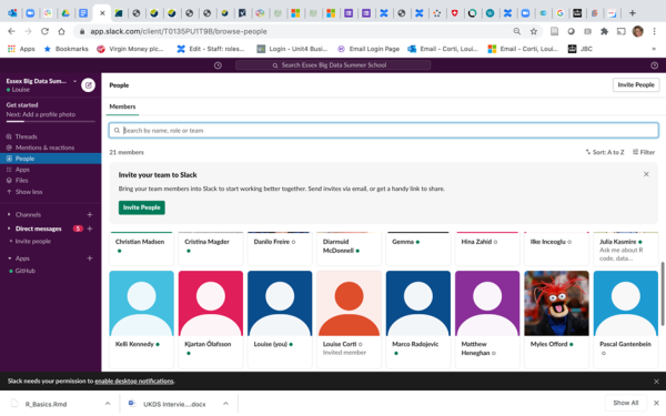
Image: Collaborating on Slack
Syllabus highlights
The first day covered more theoretical and practice issues around the ethical and legal sourcing of data, such as from APIs, and keeping code documented whilst days 2-3 ramped up the tech, learning how to use various R packages to clean manipulate, join and map data, such as TidyR and Tidyverse, GGPlot, RLeaflet, Plotly and html widgets.
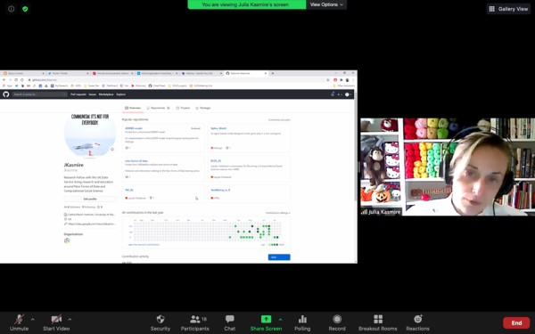
Image: Julia on Zoom, introducing TidyR
I’ve long been a great fan of the growing reproducibility agenda and have blogged on the challenges of this for qualitative data and ran the 14 February #LoveYourCode event with the ONS this winter.
With reference to this Big Data course, the theme of reproducibility ran throughout the week.
From day 1 we ensured participants were fully aware of the need to document, track and share code and properly cite any data they use.
We showed them how to use R Markdown and how to add any code they have created during the day, for example from practice exercises, to their own GitHub account. Additionally, we made sure this aspect is covered in a dedicated session to look at the challenges of reproducibility from the re-users perspective. Diarmuid prepared an excellent practical exercise for Reproduce This!, where participants had to recreate the following graph based on API Police Data (Stop and Search statistics by Age and Gender).
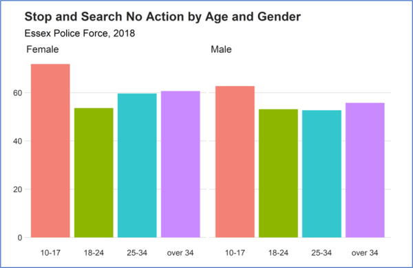
Image: Graph from API Police data for Diarmuid’s ‘Reproduce this!’ exercise!
Group work and Zoom breakouts
While the teaching was fairly straightforward, with a single tutor running a dedicated session of the course, covering presentation, demo and exercise, the group work needed more thought. Zoom breakout rooms were trialled and used for group discussion. Groups of 3-4 were facilitated by a single tutor.
A thought experiment on creating a national statistic
The first example of this activity followed Louise’s session on ‘Big data, social science and social surveys’, which demonstrated some of the experiments undertaken by a group of National Statistical Institutes (NSIs) on comparing national statistics gathered from surveys or admin data to those gleaned from using web-based data sources. An example was using Wikipedia page visits for measuring the popularity of UNESCO World Heritage Sites versus collated counts of visitors to the sites themselves.
The main class was split into 4 groups, using Zoom breakout rooms, and each group attempted to invent their own ‘National statistics experiment’ by using non-traditional data sources to (theoretically) produce a nationally important social economic finding. Tutors helped facilitate each group and the whole group then reconvene to present their ideas. This year we saw the following innovative ideas emerge from our Zoom groups:
- Group 1: Measuring attitudes toward nuclear power in South East Asia, using sentiment analysis on tweets about new nuclear power plants.
The group hypothesized that richer nations would express a more positive sentiment, while poorer nation a negative one. An interactive bubble chart could be used to display sentiment by city/region. Problems with representativeness, access to the Internet and language issues were noted.
- Group 2: Predicting whether denser local areas are most at risk from Covid-19 recovery in the BAME population.
Recovery times from hospital episode statistics by local authority would be used to create a real-time dashboard/ map.
- Group 3: Monthly absences for primary and secondary school teachers and correlation with longer-term outcomes for pupils in South Africa.
This group hypothesized that teacher absences towards the end of the month would be greater, as people needed to get shopping done, and this may have a detrimental effect on pupil outcomes. Explanatory data could include teachers’ mobile phone to track movements, and their dates of bank and shopping transactions; while outcomes could be impact on learning, such as next educational step, salary level or entrance into top Universities. While a policy outcome might be that time to shop and bank could be facilitated by the schools system, ethical concerns were raise about the surveillance aspect of the topic.
- Group 4: The effects of exposure to dangerous levels of pollution for commuters in cities.
Street sensor data could be used to measure the local carbon particulates, while footfall could be measured by various means; geospatial location data from commuters smart phones could track their whereabouts, such as Google location data or checking into places on Facebook, or CCTV to capture footfall. Issues with data might be getting hold of commercial sources of data, assessing the measurement of pollution in a wider area surrounding the sensor point (e.g. 500m), and not knowing if commuters are wearing an anti-pollution mask! A Glasgow map already shows people moving in real time, highlighting peak commuting times in the day. The outcome might be policy makers levying tariffs for cars in certain areas of the city to reduce pollution at key times.
Using hacked data for research? Yes or No?
A further group exercise asked participants to debate if it would ever be OK to use hacked data for their research.
Drawn from the Patreon case study, the debate unearthed a varied set of perspectives and observations, from certainly not using in due to ethical and reputational concerns to having a go; by either deleting the private data or seeking approval from one’s ethics committee.
While the groups posited ‘who decides what is public good?’, they all agreed that it was really hard to disentangle what constitutes an ‘illegal’ act, and ‘how ethical’ one should be in the pursuit of research.
The projects commence
On day 4, the formal learning ended and the projects commenced. Participants were asked to undertake a small piece of analysis based on what they have been shown so far. The scope and criteria were:
- use tools and techniques already learned
- use the data sources suggested. If very keen to use another source, check with tutors whether it is published and QAed as open data
- points for paying attention to: ethics, transparency and reproducibility
Tutors were on hand to ask questions via Slack channels with Myles and Diarmuid covering API support and formats, data extraction and loading, and Julia, Simon and Diarmuid covering R support, data preparation and analysis.
Our tutors offered some useful refresher tips before the projects were started:
| Area | Top tips |
|---|---|
|
Using APIs for accessing data |
· Check documentation is good · If not good, then check if it’s being used regularly and look for any helpful comments · See if there is a package in R that can do the heavy lifting to access the API · Try mocking up the APIs at Insomnia, copy the URL of the documentation into your browser; you don’t need to register. Save as a single request to use · Check data types and column formats which can be as issue when downloading from APIs · You cannot convert a data type/format (e.g. alpha-numeric to character) using TidyVerse; convert existing data formats to a Tibble dataframe, then change or ‘mutate’ a column
|
|
Using GitHub for code sharing |
· Use Desktop Github to upload changes
· Comment your changes and push to live · Try to make small commits, instead of just one larger one, as less room for error · The ‘Collaborator’ function is useful for when working in groups and for project work · Make a ‘request’ for changes to be added, so that your collaborator can approve your changes |
| Using Slack for help | · Use different Slack channels for different purposes to avoid too many messages.
· Private and public channels are available · Users can create their own new channels e.g. for their projects · For private channels to be set up, the instigator will need to ‘invite’ others |
This year, the group projects worked a little less well than previous face-to-face courses. Groups usually self-select, made up of 2-3 people, and then anyone left can join a group who has a concrete idea.
For this year’s course, around half of the 14 decided to work through the earlier days materials themselves, wishing to reinforce the learning, rather than going it alone. This suggest that learning proceeds at a slower pace online, and it may be preferable to cover less material in more depth.
Participants went on to complete a mini project; a great variety of topics were pursued, but most opted for mapping results, perhaps as it is always a very satisfying endpoint for analysis.
| Topic | Data source | Data issues | Analysis |
|---|---|---|---|
| Mapping 19 years of assistance with social income in Zurich | Zurich open data, covering information on social income assistance over a 19 year period | The column types were incorrect, so initial importing was a problem (changed). Spatial file issues too,
Files were exported but not the images |
SF package
R Markdown |
| Mapping of wealth in Zurich | Election results at municipal level on a map. | Data gained from Swiss government and were not R-ready, but some easy data cleaning, cut and rename a few variables. The initial Shape files were huge and had to be cut down. | R visualisation tools
Choropleth by party, and clicking on a party highlights region where seats were won |
| National picture of fertility in Denmark | Danish Statistics databank, fertility data from 2007-2013 | Initially connecting to the API was difficult, and data format issues. As new to R, hard to merge the Shape file with the data. | R. Stats show a decline in fertility across the years. Would like to go onto look at contributing causes |
| Visualising human rights abuses | Statistics about the prison population via the API for the World Prison Brief, from the Ministry of Justice website. | Hard to make the Shape files work. The API was inconsistent. | Used ggplot to cluster prison population by continent. Used httr, R Natural Earth and SF packages (latter did not work with ggplot).
Added code to GitHub |
| Plotting the magnitude of earthquakes | Earthquakes data from Kaggle | Classified detailed levels of magnitudes into moderate, extreme etc. Used ggplot and leaflet to map them by location. | |
| Trends in COVID 19 infection and country-level strategies | COVID 19 API logging confirmed cases by country | Premium data was expensive; free data quite basic | Aimed to use ggplot and httr to plot country level cases by strategy |
The social side of summer schooling
For our usual summer school, the first day sees after work drinks and snacks to help break the ice, and get participants introduced to each other and to tutors. Without this opportunity, we agreed that some kind of social event was needed.
Initially, in May we agreed on a quiz, but by July, Zoom Quiz Fatigue had definitely set in. Julia cleverly suggested instead, a Scavenger Hunt, where the aim was to go and find a listed item in a short space of time (or example, a shiny object within 30 seconds). With five remaining post-first day attendees and six tutors, the Hunt turned out to be a rather good ice breaker! For the shiny object, CDs werea popular choice!
Challenges of Zoom intensive courses
While on balance, the course worked better than expected, there were some obvious and unavoidable challenges.
The biggest was the time zone factor; participants from locations that are geographically far away from the course time zone, may well suffer from time zone incompatibility. Two of our group came from opposite sides of the world; Singapore and Western USA, with a time lag of 8-10 hours. This meant they would need to stay up all night, both only lasted 1-2 days then had to stop attending in real time, but did continue to download and follow the course materials. They were grateful that we were so well organised, by publishing our slides, demo videos and exercises the night before for the following day, on the shared course Box area.
The combination of taught and (albeit very limited) research approaches appeared to be really welcomed by participants. The push from the tutors to think creatively was also appreciated, and helped stimulate an appetite for looking at new and unfamiliar secondary data sources.
Louise observed that
“some of our attendees were really grateful to be able to use the course to take welcome time out from their busy virtual work lives, to do something a bit challenging”.
In summary: pros and cons of a virtual summer school
| Issue | Pros | Cons |
|---|---|---|
| Online conferencing | · No room hire or catering, so course cost can be reduced
· Zoom rooms for breakouts |
· International time zones
· Fatigue and Overload (Zoom out) · Harder for group work |
| Presenting mode and style | · Easy to see screen to present
· Relaxing presenting environment · Assurance of familiar technology |
· Cannot ‘see’ participants, as video off; hard to gauge reaction to presenting
· Demands succinctness of presentation materials · Demands absolute clarity of exercises; step-by-step |
| Communicating | · Tools like Slack are invaluable. Homework and Social channel can be set up
· Good for more introverted participants |
· Unfamiliarity/discomfort with communication technology e.g. Slack
· Harder to support those struggling with technical tasks |
| Informal networking/bonding | · Covid-19 times recognised by all as being challenging
· Zoom for scavenger Hunt |
· Need a break from screens
· Less opportunity to bond in groups · Cannot meet informally, i.e. share a coffee/drink/meal |
Feedback
“Thank you for all the great workshop days this week. It’s a comprehensive course.”
“It’s been very inspiring.”
“I very much enjoyed and appreciated all the insights I got in the course! A lot has been new to me as I’ve been working quite differently in the past. I’m also impressed by the teaching from you and your team! I will definitely recommend this course to our PhDs and PostDocs!”
Postscript
This is to be the last summer school I run as part of the UK Data Service at the University of Essex.
I’d like to say a huge thanks to all the folk who have taught with me on our big data escapades over the past four years: Sharon Bolton, Darren Bell, Libby Bishop, Nathan Cunningham, Julie Kasmire, Cristina Magder, Diarmuid McDonnell, Myles Offord, Chris Park, Simon Parker, Peter Smyth, Deb Wiltshire.
About the author
Louise Corti is Service Director, Data Publishing and Access Services for the UK Data Service. Louise leads five teams dedicated to bringing in and disseminating data, as well as supporting data creators and users of our secure access data. She has special expertise in research integrity and governance, research data management and the archiving and reuse of data or the social sciences.